Pearlies Mobile App
Pearlies is a mobile app for orthodontic patients to record their journey with braces. The name “Pearlies” is derived from the term “pearly whites” describing perfect white teeth.
Pearlies is a mobile app for orthodontic patients to record their journey with braces. The name “Pearlies” is derived from the term “pearly whites” describing perfect white teeth.
The app is a concept born from personal frustration with the lack of user-friendly orthodontic apps available. I was unable to find apps which serve to save data and content specific to orthodontic patients. Therefore, I decided to design an orthodontic diary app for the purpose of storing relevant information.
Techniques
User surveys
Empathy maps
Persona & User pain points
User flow
Information architecture
Low and high-fidelity prototypes with Sketch and Invision
Competitor Research
A browse online through the current braces app shows focus on braces care, physical appearance and appointments. The most advanced and well covered app is the Dolphins MyOrthodontics, as it covers patient information, the orthodontist, FAQ and a photo gallery.
However, these apps focus on aspects of the braces and lacks personalisation to capture the whole process. None of the apps contain a recording option other than photographs. This limits the user preference and focuses on parts of their journey but doesn’t capture the whole journey.
The user interfaces are outdated in design and are unappealing for younger age groups, which cover the wider audience.

Left to right, Dolphin MyOrthodontics, BraceMate, OrthoCalendar, Braces App

Online survey with 56 orthodontist patients
User Research
56 people were surveyed in a questionnaire on their views and relationship with braces.
Notable findings
Ages range for patients were 10-30 years old with the average age 20 years old.
55% agreed seeing progress made them feel better about braces.
44% were nervous about braces upon first installation.
74% would like to see how long they’ve had braces for.
Patients often scoured the internet on how to care for their braces
Persona & Customer Pain points
Two personas were developed representing the two age groups of audience.

User Flow
Three user goals were derived from the data to form the core functions of the app
Add new appointment
Add new diary entry
Update countdown date

Information Architecture
An information architecture was designed to lay the structure of the app and categorize information.
Five main areas were decided
Account
Calendar
Information Hub
Diary Entries
Gallery

Point of difference in the app
Timelapse selection of merging photos together to produce videos
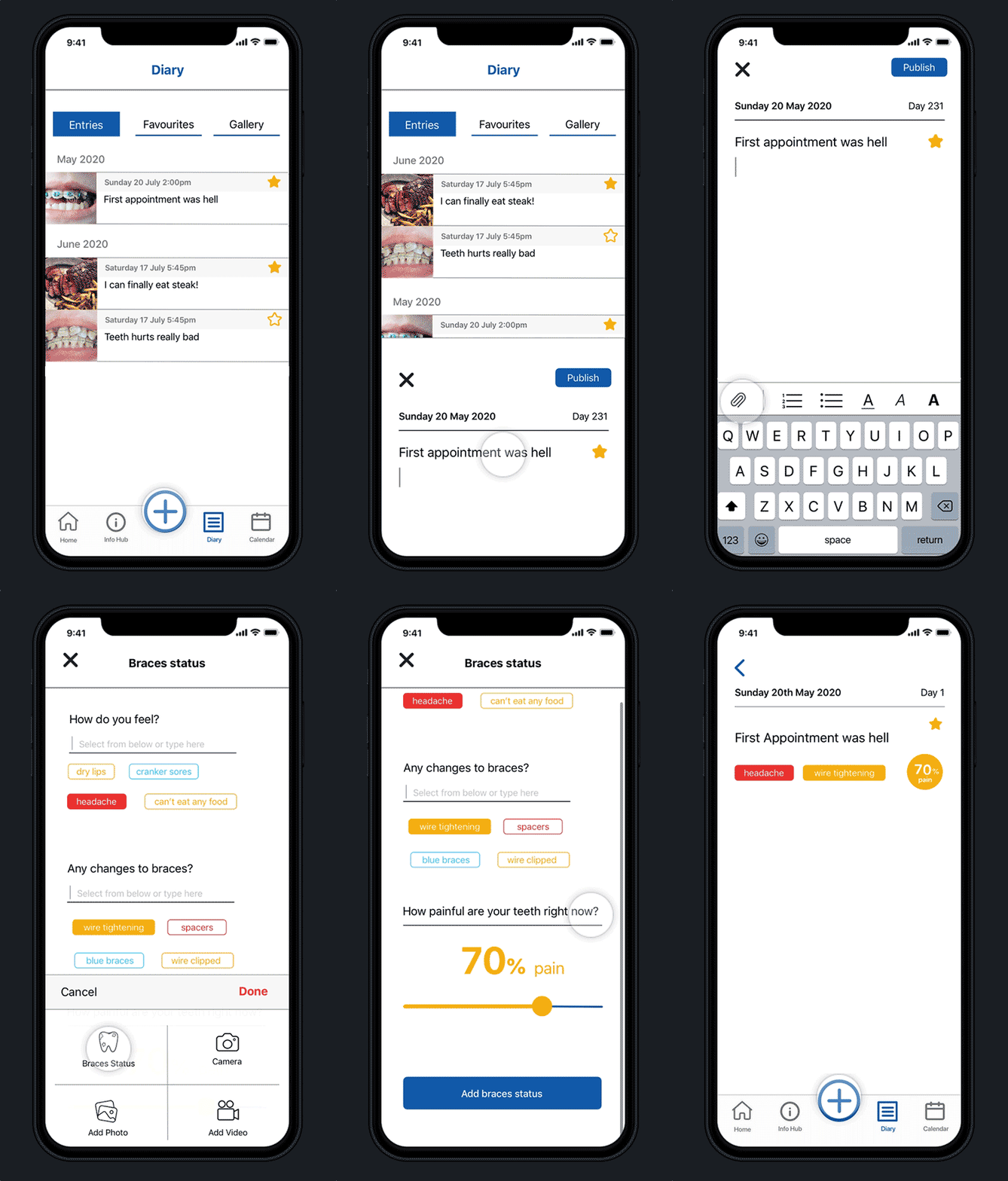
Braces status in diary entries for personalisation
Appointment section
Information hub to educate patients on how to care for braces.
Countdown date to display timeline and provide context for time of braces.
Prototype and testing
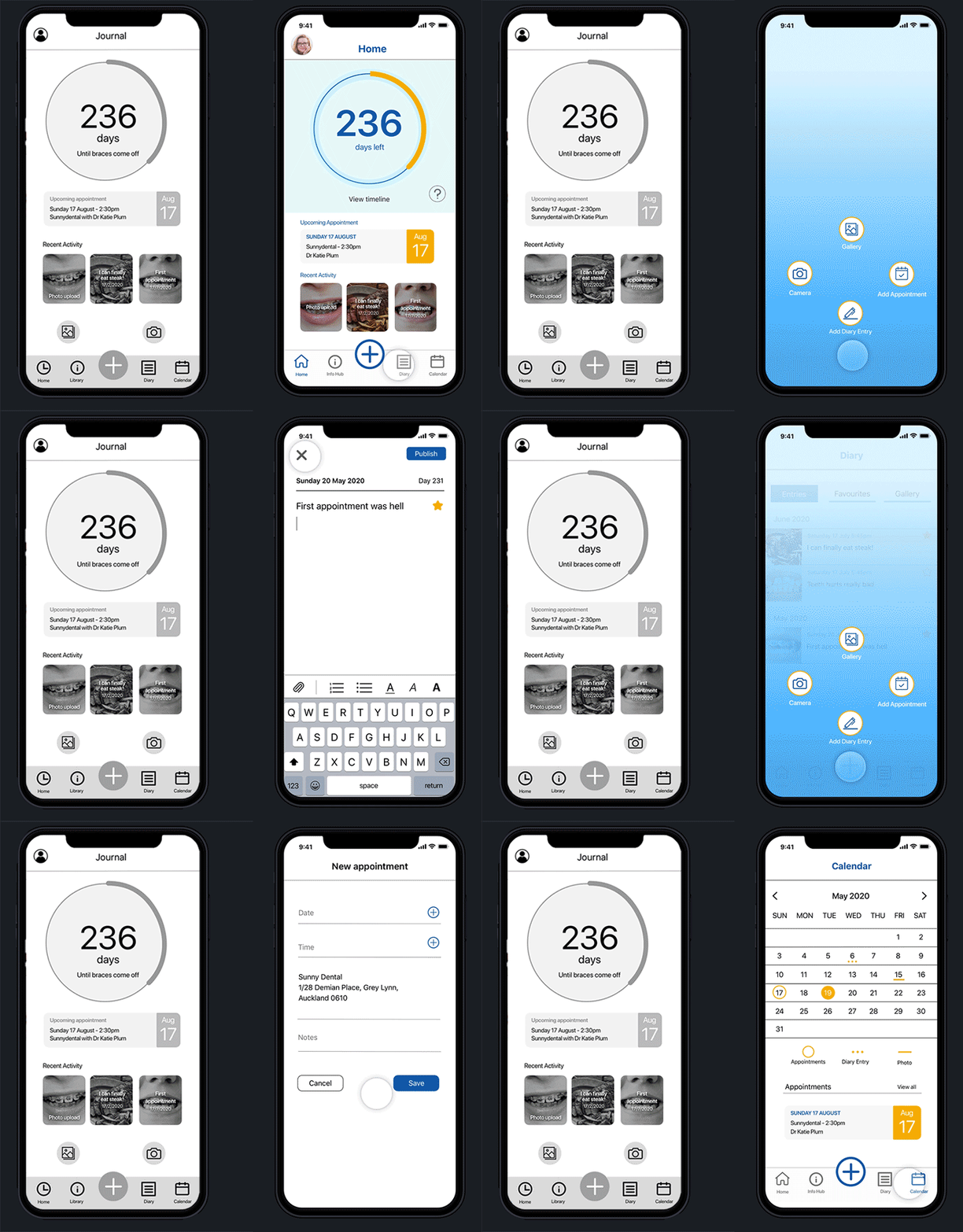
Sketch was used to create grayscale low fidelity prototype based on hand drawn sketches.
Five sessions of user testing was done remotely via Zoom.
Three interviewees had braces in the past, while two didn’t. The purpose was to test how accessible the app is for everyday users.

Sketches and prototype testing

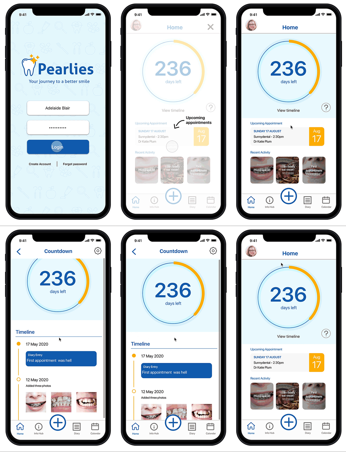
Collections of screens designed for the final prototype.


Findings
Plus Button
The purpose of the button caused confusion on whether it added an appointment or added a diary entry.
Therefore the plus button became an entry to a second menu with access to secondary menu actions.

The plus button in the intial design took the user to create a new dairy entry.
Countdown
An on-boarding process displays for first time users introducing the areas of the home screen and is accessible with the question mark.
It wasn’t clear the Countdown was clickable in the testing and it is an important aspect of the apps’ relationship with orthodontics.
Therefore a clickable link was included below to indicate further content with the countdown.

An introduction pop up appears for first time users of the app.

Braces diary menu
The wording and options caused confusion in the purpose of these actions.
The selection is repetitive and requires extra effort for small results.
Solution is to merge all options into one screen for faster selection less effort required.

Future developments
As the concept develops, future functions are also considered to be added onto the app.
A reward system to increase incentive to return usage of app.
Online forum to share content with others online
Notifications system to remind user to take photos and appointments.

Reflection
The user research and feedback is the core of the app. However, upon consideration more concise questions on usage of technology and needs on patients would provide more informative data to work upon.
User flows and information architecture provided directions for the design, yet too much time was spent designing features which weren’t crucial to the app. Therefore, tighter scoping and consistent reference to user goals would have saved time and effort on the overall project.
“The app is very thoughtfully created and designed to support the patient through their journey of orthodontic treatment and very much patient centred”